kill the book-a-demo button
A lot of small products have a “book a demo” button, copied from an enterprise site that sells six-figure contracts. On a product that costs a few dollars a month, that button turns a ten-second question into a three-day wait. This is part three of our weekend series on selling when you’re small.
who the demo is for
A demo makes sense when the deal is big. Ten people have to agree, a lawyer reads the contract, and someone needs to see the thing live before they sign for a year.
That’s not your buyer. Your buyer is one person, with a card, on your pricing page at 11 pm. They don’t need a guided tour. They need one answer and a button that says “start”.
what the button says
You meant “we’re happy to help”. The visitor reads something else.
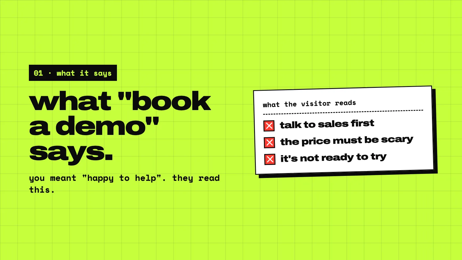
- “You have to talk to sales first.” Nobody wants a sales call to find out if a tool fits.
- “The price must be scary.” If you need a call to say it, it’s probably a lot.
- “It’s not ready to try.” Why else would they need to show it to me?
Every one of those pushes a small buyer toward the competitor with a “try it free” button.
the wait
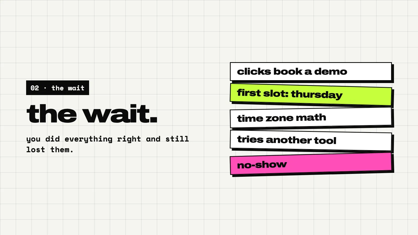
Follow one visitor through it. They click. A calendar opens. The first free slot is on Thursday. They pick it, do the time-zone math, and put it in their calendar.
By Thursday they’ve looked at two other tools, one of which let them try it on the spot. They forgot why they booked. Maybe they show up, maybe they don’t.
You did everything right, and you still lost them to the wait.
what to put there instead
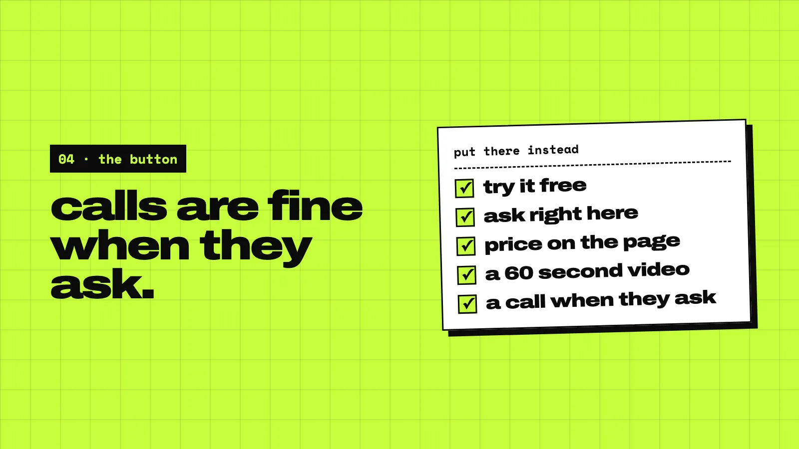
Replace the demo with things that answer questions now.
- A button that starts a free try. No card if you can manage it. Let people touch the thing.
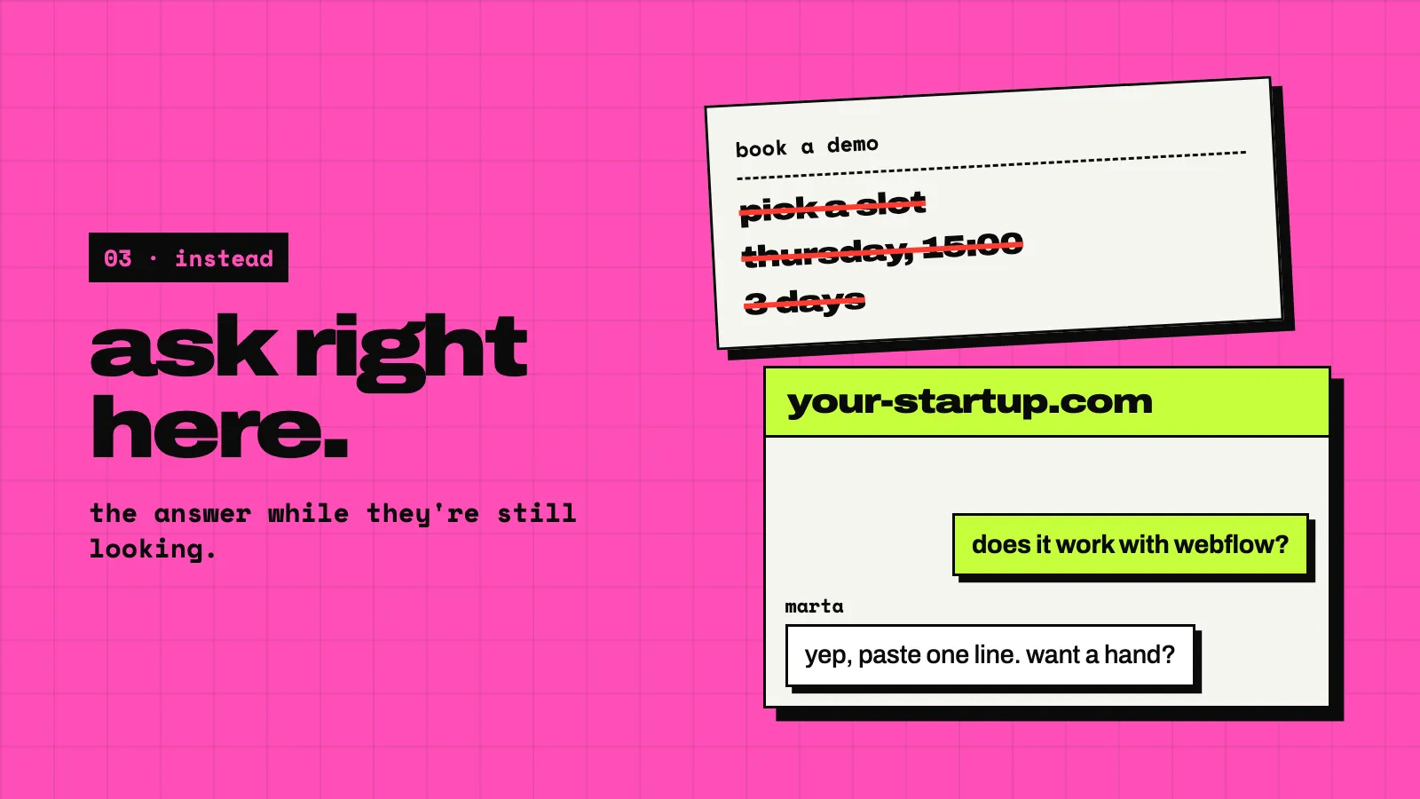
- A way to ask right on the page. A chat, answered by a human, while they’re still looking.
- The price, on the page. If it changes by size, show the sizes.
- A short video. Sixty seconds of the product doing its job beats a 30-minute call.
when a call is right
Calls aren’t evil. Some people want one: an agency setting up twenty sites for clients, a company with a security review, someone with a weird setup.
Let them ask for it. Once someone writes “can we talk?” in the chat, a call is a favour, not a hurdle. You offer the calendar link then, and they take it happily, because they chose it.
The difference is who asks. A call someone asked for goes well. A call you forced on them to see a price mostly doesn’t.
what we use
On spookat.com there’s no demo button. There’s our own chat and the pricing, right on the page. That’s the thing we sell, too: a small chat for your site where visitors ask and you reply in a Slack or Discord thread, or in our inbox and its phone app.
Until someone clicks, it makes 0 requests to our API. It’s $4.99 a site a month, with 14 days to try it and no card, and no demo. See how it works.
Tomorrow: how to write your landing page from your chat log.