8 styles, 17 fonts, one widget
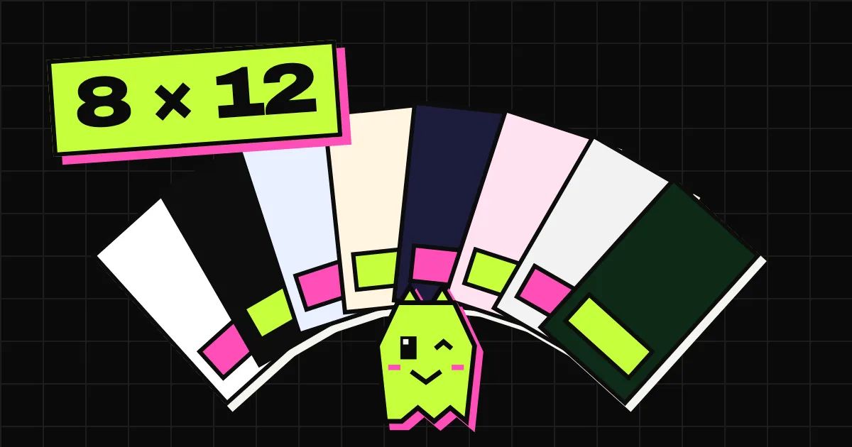
Most chat widgets come in one shape: a round bubble in the corner and a white card with a header in your brand colour. Spookat comes in 8 styles and 17 self-hosted fonts, and each style has its own voice too. Here they all are, on a phone, with the same three messages.
why more than one look
Your chat is part of your site. A brutalist portfolio with a soft pastel bubble in the corner looks like someone else’s site bolted on. So the widget should look like it was designed for the page it’s on, and a colour picker alone doesn’t get you there.
Every style is a full design: layout, type, spacing, the launcher, and the words. The greeting, the placeholder and the headline change with the style, in all 12 languages. The one thing that never changes is the promise underneath: a person reads this, and the reply waits for the visitor.
the eight
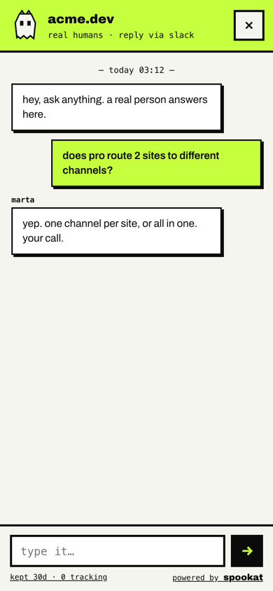
brutal
Hard borders, offset shadows, lowercase, a mono subtitle. It talks like we do: “hey, ask anything. a real person answers here.” The default when a site hasn’t picked anything.
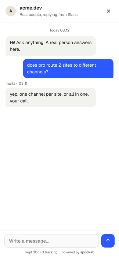
clean
Quiet grey bubbles, one accent colour for the visitor’s messages, sentence case. The style for a SaaS dashboard that doesn’t want to be noticed.
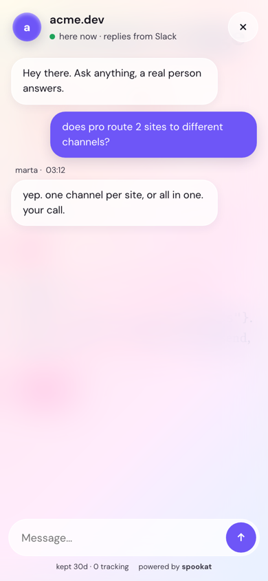
glass
A frosted panel over a soft gradient, a round avatar, a green “here now” dot. For product sites with a lot of blur already.
soft
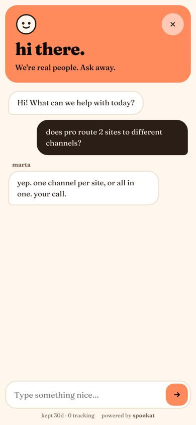
A warm serif, a smiley in the header, big round corners. “Type something nice…” For shops, bakeries, anyone selling something you’d give as a gift.
terminal
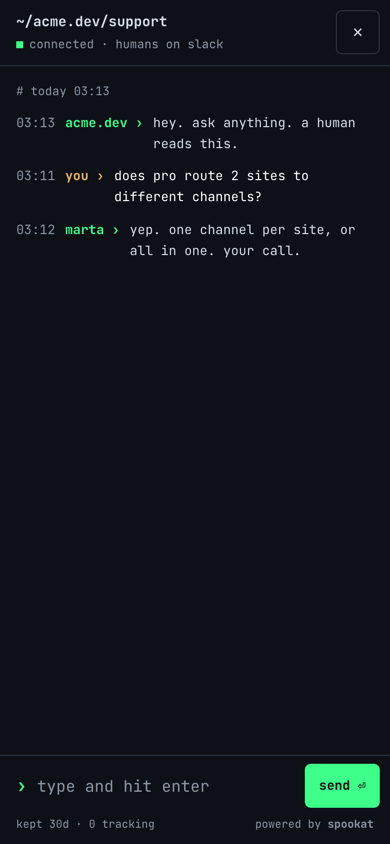
Dark, mono, a prompt instead of bubbles: ~/acme.dev/support, timestamps on the left, “type and hit enter”. For dev tools and people whose whole site is a README.
paper
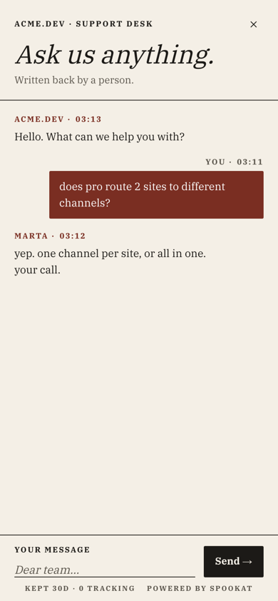
An editorial layout: small caps bylines, a big italic “Ask us anything.”, a “Dear team…” placeholder. For studios, magazines and law firms that care about kerning.
retro
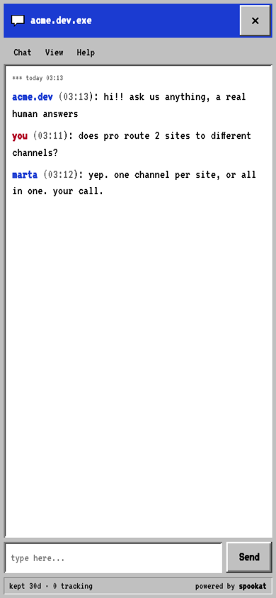
A window from 1995 with a title bar, a menu with Chat, View and Help, and a pixel font. It’s a joke you can put on a real site, and it works like the others.
swiss
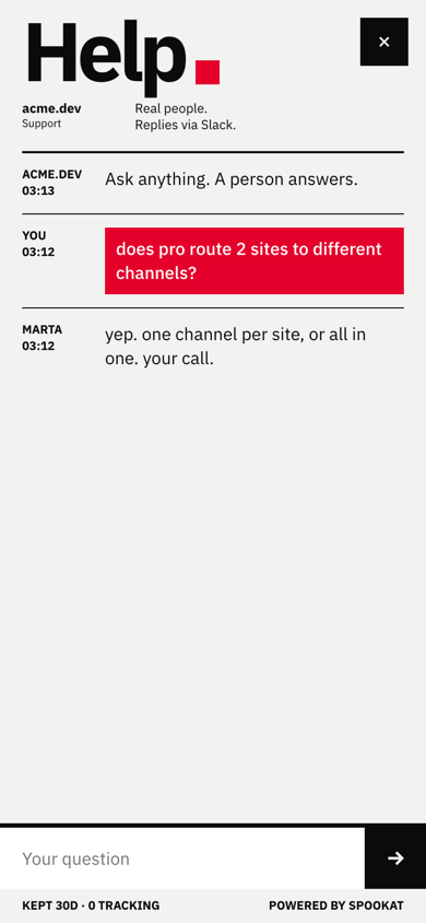
A huge “Help.” with a red square, a grid of names and times, rules between messages. For design agencies and anyone who owns more than one Helvetica poster.
what a style costs
Here’s the part we care about most. The launcher that every page loads carries two buttons, the default (brutal) and yours, and no other style’s: about 2.2 to 2.4 kb gzipped with the look inside it, depending on the style. The style’s CSS for the chat itself loads only when someone presses the button, and only that one style: about 2.3 to 2.5 kb gzipped for each of the eight. The panel script is about 17.5 kb gzipped.
Fonts load the same way. A style’s font is registered only when the panel opens, and the browser fetches only the character ranges the page actually uses, so an English chat never downloads the Polish accents. Pick “system” as the font and nothing is downloaded at all.
All of it comes from our own CDN. No Google Fonts, no third party.
making it yours
In the dashboard you pick a style, an accent colour, a font, the side of the screen, a greeting and, if you want, a logo. You can also turn the round launcher into a pill with your own text, like “questions? a human answers.” The dashboard shows a live preview while you click around, and a published look reaches your visitors within a minute.
If a page needs something different, a few lines in the snippet override the look for that page only:
<script>window.Spookat = { style: "terminal", accent: "#39ff88", side: "left" }</script>On vc money you can go further with your own CSS for the widget.
why we bothered
Because a chat widget is the one piece of someone else’s code that talks to your visitors in your name. It should sound like you and look like you, and it shouldn’t make your page slower to do it. Eight styles and a launcher of about 2 kb is how we squared that.
Try all 8 on your own site: the trial is 14 days, no card.